Ali The Expert

Logo

Immersive Image Design Can Inspire Consumers to Purchase More

According to Statista — and as you may have noticed yourself — people all over the world spend more than 2½ hours every day on their smart phones, and another ½ hour at their desktop.

ome of this time is devoted to entertainment, and some is no doubt spent on conducting business or simply conversing with someone.

As for the rest of the time, it’s often spent looking for information on things to do outside of their screens, which could involve anything from looking for information to shopping for a product or service.

If you have or are building a website that sells a product or a real-world experience, you should be giving this some thought. The most effective way to sell something is to let the consumer “feel” it.

08.-Interactivity

Changing Typography Draws Attention to Content

Changes in website typography size, color, and style are often employed to great effect as attention-getting strategies. In 2022, we’re going to see motion added to the text as well.

Motion in an otherwise quiet or still setting is always noticeable, and strategically placed and well-timed motion applied to content can really make a website stand out in the crowd.

BeDietShop does this effectively in its hero image by directing attention to tasty food items.

BeDietShop does this effectively in its hero image by directing attention to the tasty food items.

Line Art Backgrounds Can Be Used to Serve As Useful Guides

Web designers have been experimenting with various website background trends for years. More recently, the focus has been on the use of dramatic gradients. Background video sliders and dark mode color schemes have also been popular.

In 2022, it’s going to be something quite different. Line art will be used to create visual interest, and just as importantly, will also be used to provide visitors with helpful guidance.

BeDietShop does this effectively in its hero image by directing attention to tasty food items.

As you’ll see, pointing a visitor in the desired direction doesn’t require using arrowheads or pointing fingers. More abstract designs can be put in play that suggests rather than a point but ends up having the same effect.

The circles in the two corners are, in their own way, attention-getting. Of even greater importance is how the shapes curve inward. In doing so, they draw greater focus on the booking form in the center.

maxresdefault

Interactive Graphics Provide Added Context for Users

Most commercial web designs address three basic objectives: attracting visitors, engaging them with the content, and getting them to convert.
Engaging visitors involves getting and holding their attention, and there are right and wrong ways to go about it.
One very good way is to make key elements look interactive — like making a button look like it’s begging to be clicked, instead of looking like any other flat object on a flat surface; or like making a design element change or animate when a visitor hovers over it.
But you need to be creative. There will be instances where you want a visitor to stop and learn more about something as opposed to using interaction to keep them constantly on the move towards some desired goal.
One example of getting a visitor to pause is to take what normally would be scrollable content and replace it with a slideshow experience — as BeInterior6 does at the top of its home page.
In fact, scrolling has become so automatic that you may need to add clear controls in some cases to get or enable visitors to stop and be able to engage with key or important content.

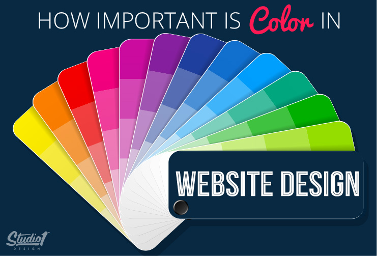
Use Positive Color Palettes to Send the Right Vibes to Visitors

Designers used to obsess over selecting the perfect color to bring about a desired emotion from a visitor.
It’s no secret that a given color can elicit a certain emotion given the context it’s being used in, but what is the underlying theory?
The truth is, there are several factors involved, like the shade of the color, its contrast with other website colors, the culture of the observer, and the aforementioned context in which it appears.
Asplash of yellow can elicit a feeling of happiness, but splashing yellow throughout a website probably won’t create a happy customer or lead to a conversion.
One example would be to use a color scheme that creates a gentler experience. The BeBabyShop pre-build website uses soft tone backgrounds surrounding the products.