
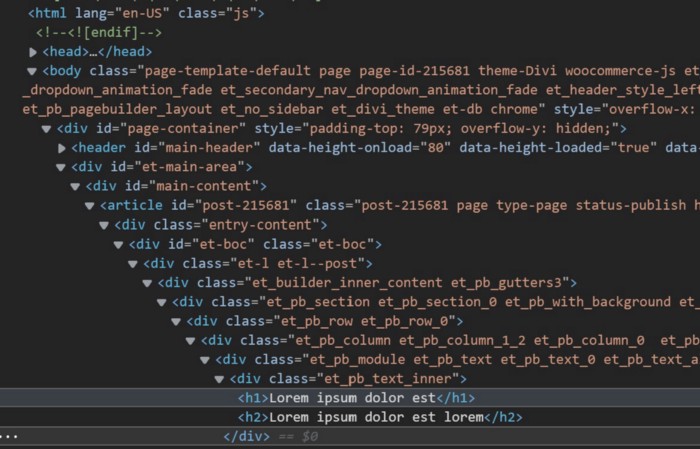
One big issue: “DIVitis”
If the markup of a website mainly is structured by a lot of nested divs, and the divs are there only for layout reasons, its called a DIVitis. Look at the screenshot down. It is taken from a template of Divi, a template system for WordPress.
The main idea
Every time you write class names for divs that contain a tag name, you should replace the div with the corresponding semantic tag and simplify the class name.
Example:
❌div.nav-main
✔️ nav.main
Here is a list of some semantic tags.
- <article>
- <aside>
- <details>
- <figcaption>
- <figure>
- <footer>
- <header>
- <main>
- <mark>
- <nav>
- <section>
- <summary>
- <time>
My semantic HTML boilerplate
In my opinion, most websites can be built with the following boilerplate.
Please ignore the head section, this article is all about the body section. The shown head section is mentioned only for the sake of completeness.
In my code example the body has an optional div#page tag that beholds the complete page. Inside the div#page section I mostly use three sections:
header
main
footer
Header
The header section is mostly used to display the brand / logo / company name and all major navigations.
Inside the header I often use two nav elements as direct children:
nav.meta
nav.main
It makes a semantic difference to use nav elements for navigation instead of using div.nav-meta and div.nav-main. Don’t do it.
Inside the nav elements I always put uls. Inside the nav.main I often insert the company logo as an h3 element.
<header>
<nav class=”meta“>
<ul>
<li><a href=”#“>Partners</a></li>
<li><a href=”#“>Product finder</a></li>
<li><a href=”#“>Change language</a></li>
</ul>
</nav>
<nav class=”main“>
<h3><a href=”#“>Logo></a></h3>
<ul>
<li><a href=”#“>Products</a></li>
<li><a href=”#“>Services</a></li>
<li><a href=”#“>Company</a></li>
<li><a href=”#“>Contact</a></li>
</ul>
</nav>
</header>
Benefit: To address the main navigation in CSS I write the following code. You can easly read the hierachy.
header nav.main { … }
header nav.main ul{ … }
header nav.main ul li a{ …
The actual page content
In the content area I use section tags to structure all contents in logical groups. Every content section gets a class name which is just readable.
section.intro{ ... }
section.intro h1 { ... }

section.keyvisual{ ... }
section.keyvisual div.container h2 { ... }
I use divs in the content area exclusively as containers that have a layout function.V
In my example the section keyvisual has a container for headlines that is positioned absolute inside the keyvisual.
<main>
<section class=”intro“>
<h1>Lorem ipsum dolor est</h1>
<p class=”teaser“>Lorem ipsum dolor est …</p>
</section>
<section class=”keyvisual“>
<figure><img src=”images/keyvisual.jpg” alt=””></figure>
<div class=”container“>
<h3>Subheadline</h3>
<h2>Headline</h2>
<a href=”#” class=”button“>more info</a>
</div>
</section>
<section class=”teaser products“>
<h2>Our latest products</h2>
<p class=”teaser“>Lorem ipsum dolor est …</p>
</section>
<section class=”…“>
…
</section>
</main>
Footer
In the footer area I also use section tags to logical separate the content.
In my example there are two sections:
section.brand
section.legal
In the brand section I often add the logo, address and contact data.
The legal section is of a navigation type, so I use a nav tag.
Conclusion
I know today’s modern devices and browsers can handle bad code. But if you want to work more sustainable and if you want to improve the readability of your HTML code for machines and humans, revise it and optimize your semantics.